Technology
Top 6 Importance of Color in UX/UI Design
Read about the six importance of colors in UX/UI design that impacts the visitors on the website.

What is UX/UI design?
UX/UI design refer to the development of a simple, clear and visually appealing website and application design. In more detail, UX design ( User Experience Design ) is the design of the process of user interaction with the interface. That is, the UX designer thinks over the process of human interaction with the resource. UI design ( User Interface Design ) provides for the development of the visual component of the interface. And of all the components of UX/UI design, colour is one of the most important.
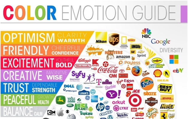
The psychology of colour has a strong influence on the reactions and actions of the user, and their combinations can create mood and evoke emotions. Using this knowledge helps UX/UI designers create better products and improve user experience. Let’s look at situations where colour matters the most.
Branding and design systems UX/UI
The biggest and most important role of colour in UX / UI stems from a company’s branding system. Designers use guidelines as a reference and apply these colours in their apps or website.
The colours of a brand are the foundation of its visual story. Their combinations, as determined by brand strategists, are important and should be broadcast through any graphics created by the company.
To select the appropriate combinations, experts use design systems. Such a system is a platform (online software, part of a software interface) where, among other rules, primary / secondary colours are defined and how they should be used. All buttons, lines, backgrounds and shapes are displayed using the appropriate colour.
Now let’s take a look at a number of features to consider when forming a palette.
Color Creates Contrast
The colors are combined to create contrast with each other. Contrast is a design tool that creates separation between elements. For example, a light background and a large bright button on it create a good contrast.
When there is contrast, CTAs are more easily noticed by users. Menus and buttons must be different from the background color, otherwise, users will simply not see them. Design systems also usually provide a specification of what color to use for backgrounds.
Color Sets the Mood
When forming a color scheme for a brand, the influence of color on mood is taken into account. For example, soft pastel colors convey a sense of calm and serenity. On the other hand, a black background with neon details creates a sense of urgency and excitement.
The color of the buttons also encourages the user to interact. This is why many CTA buttons are in shades of red and orange (as the best stimuli for reaction). People are used to seeing buttons of this color and will react to them.
Color Availability
When designing websites or apps, designers also need to consider colour accessibility. What does this mean? The colours of the system are available, which are sufficiently distinguishable for people with disabilities. To understand a design, a person must easily see and read it.
For example, red and green have no visual contrast for colour blind people. What if you have no idea what the page looks like to the end-user? You can use special filters, develop additional contrasting versions for the visually impaired, or provide for a strong contrast between the background and the foreground: buttons should have a border or shadow to separate them from the background.
Looking for the best Web Design for your website? F1Studioz is one of the best UX/UI Design Company in Mumbai?
Colors in different cultures
Another consideration for brand strategists and UX/UI designers: the perception of colour in different cultures. For example, in the United States, pink (especially soft pink) is girly, while in Japan it is part of the culture and a symbol of cherry blossoms. Another good example is red. In some cultures, it is perceived as the colour of passion or danger, while in others – wealth and royalty. Therefore, when developing UX and UI, it is important to know whom the product is targeting.
Meeting expectations
In UX and UI, there are also cliches and expected colour schemes, but companies do not always follow them. It often turns out that when the colours are different from the competition, the ad campaign or brand will be more memorable. That is, the brand’s unique colour scheme can impress the user.
The main thing to remember is that using the original layout is good, but it must follow the basic rules of UX/UI: ease of use, navigation and perception, as well as accessibility for any user.
Outcome
Obviously, the importance of colour choices in branding and UX/UI development cannot be overemphasized. Poorly designed schemes can affect the perception of the entire brand, not just a single site or application. There are many nuances to consider when choosing colours, from compatibility and consistency with the overall brand concept to important cultural characteristics.
The same applies to the design of the produced graphic content. Agree, blogs and social media accounts made in the same style look more stylish and professional. And ads with familiar graphics or colour schemes evoke stronger associations. Therefore, we recommend using all the listed rules not only in relation to UX/UI but also in the design of graphic content.


